
Bramble Organic Foods
A little more nature in every bite
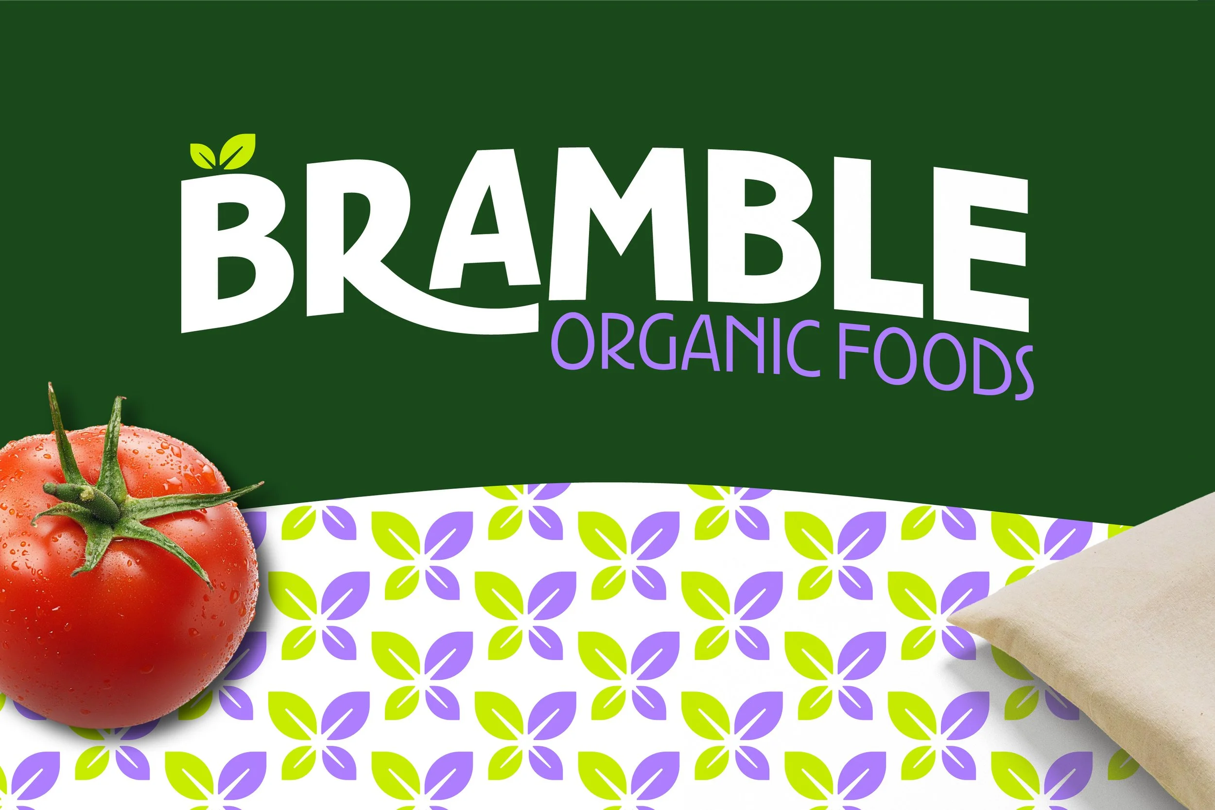
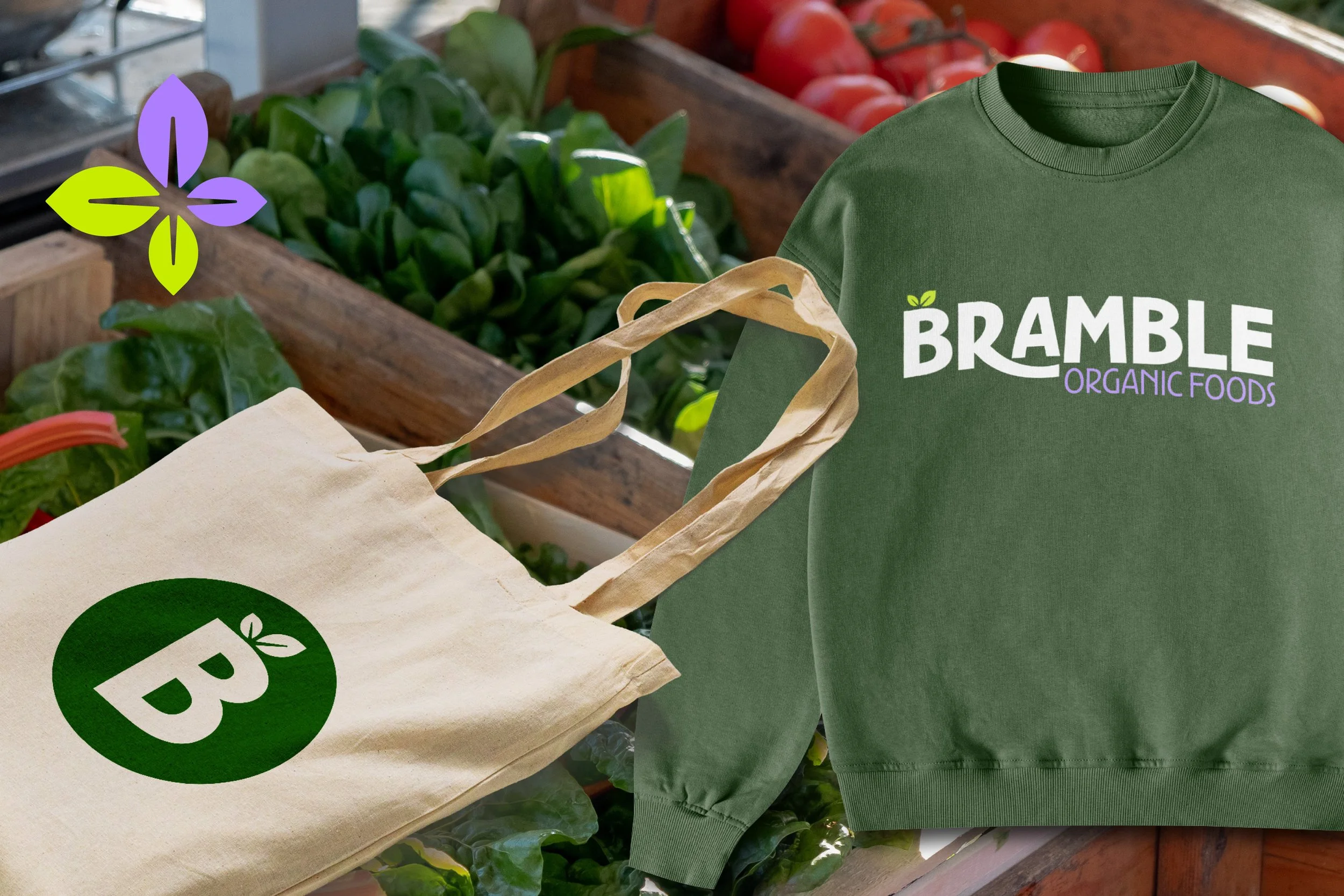
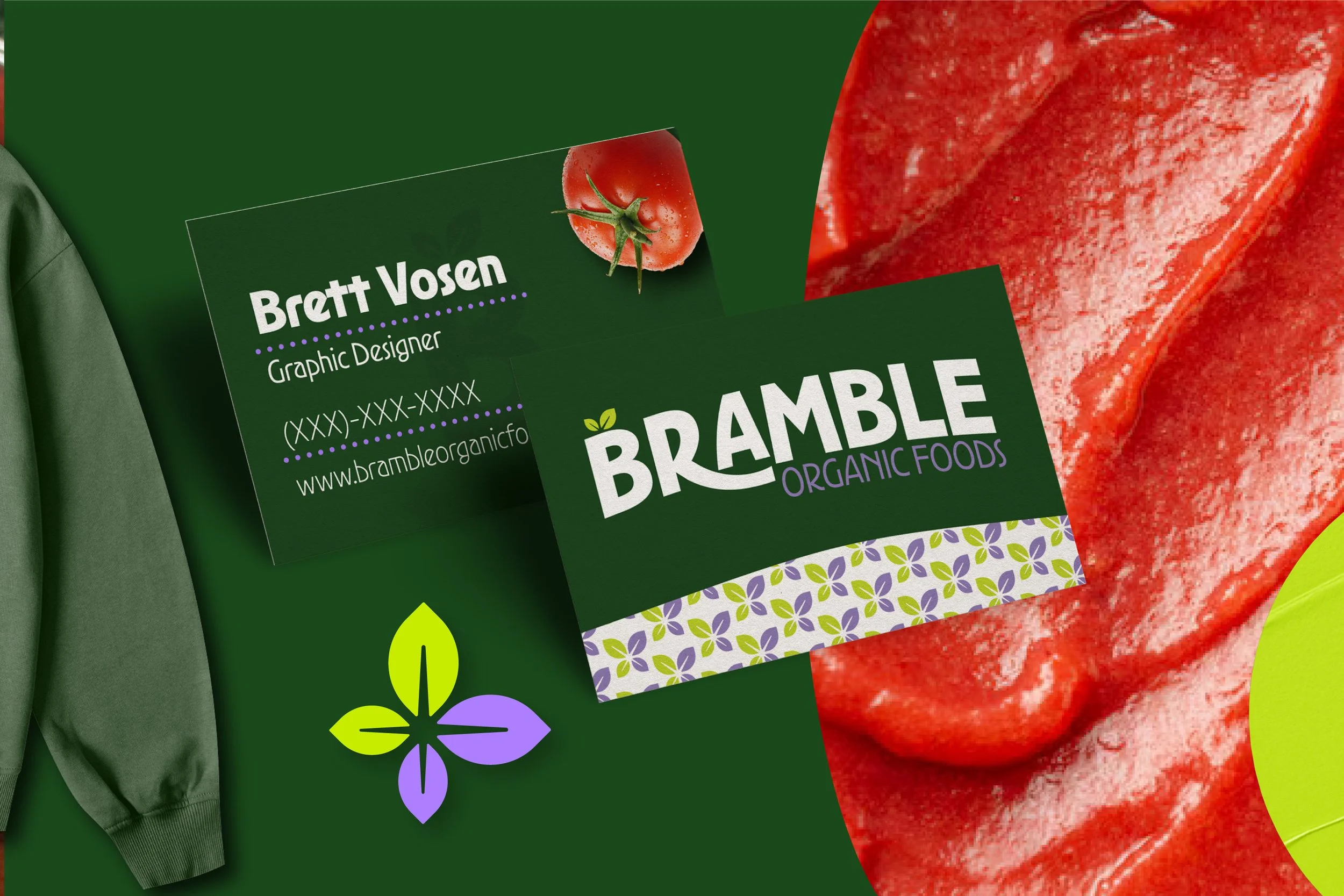
Bramble Organic Foods offers the highest quality produce you can find at your local co-op. They source their produce and products from only the freshest and trusted sources. They were looking for a brand that was instantly recognizable as something fresh and organic, but with more approachability. We landed on a bold word mark that says clean without being stiff. The colors reflect nature but also offer some lightness. Find more details on the brand aesthetic below.
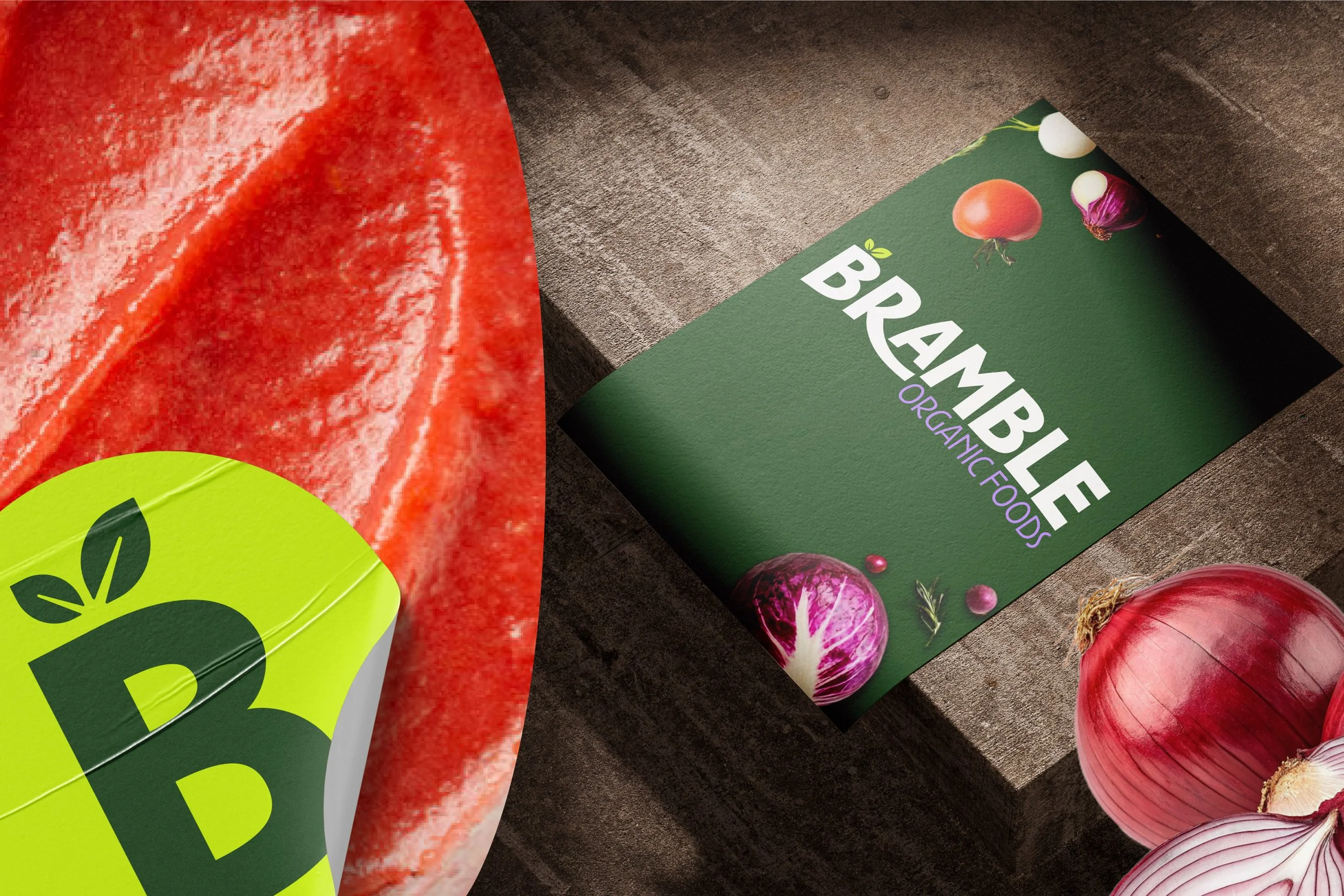
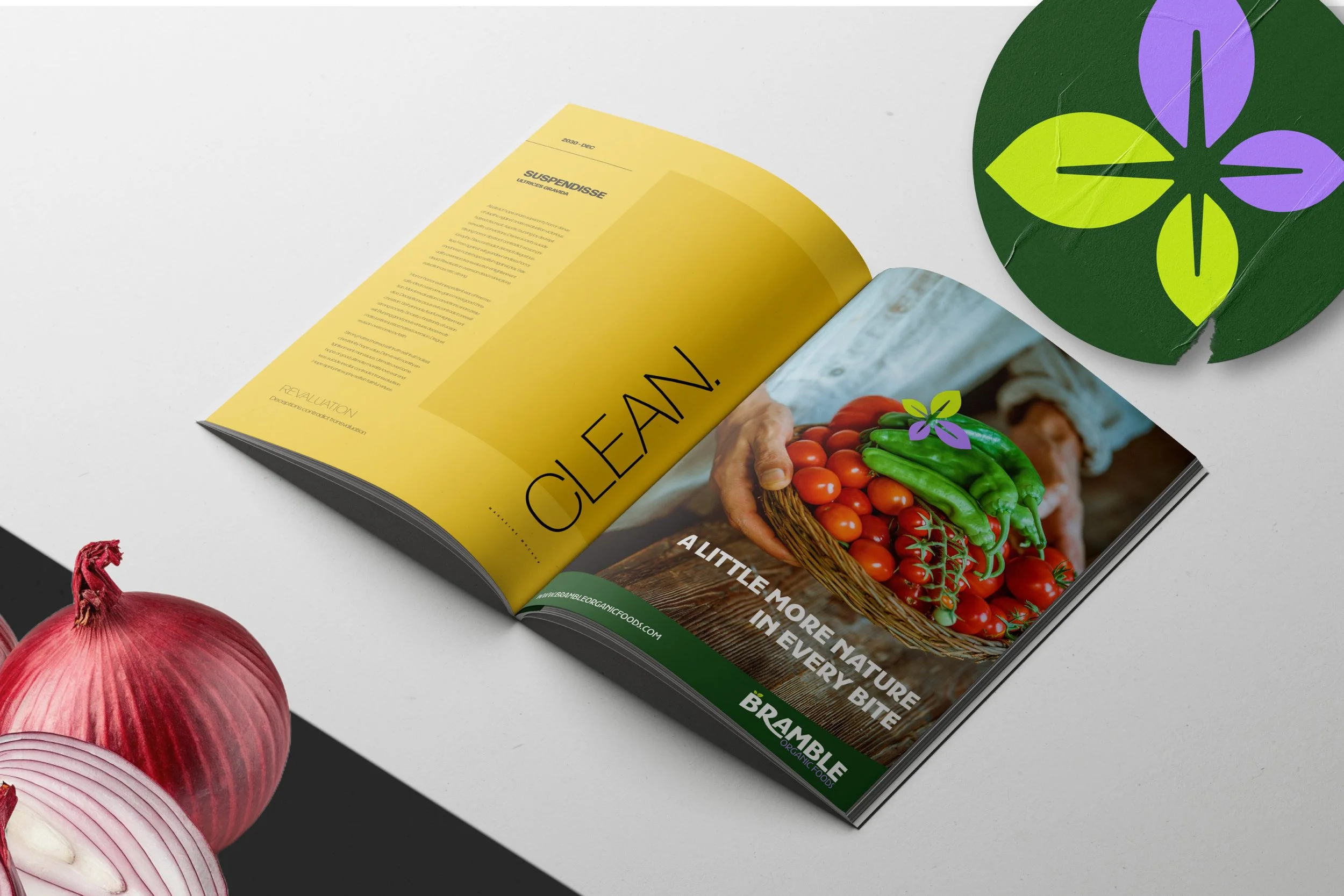
A Little More Nature In Every Bite
〰️
A Little More Nature In Every Bite 〰️
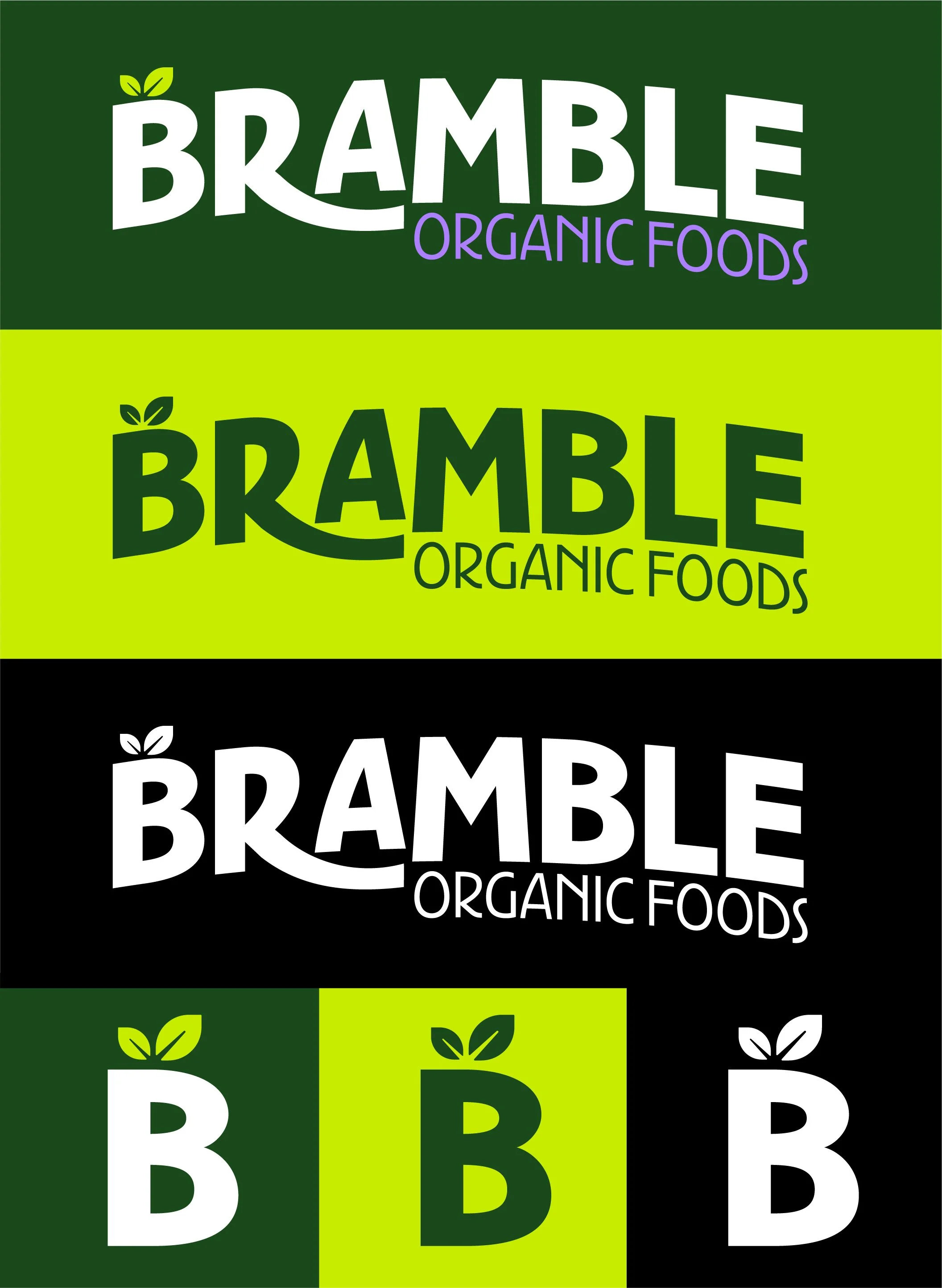
Bramble Organic Foods Logo
The goal with this logo was to create something bold, iconic and playful. We wanted colors that felt like a classic organic brand, but with a more vibrant approach. In the end we went with a mark that is instantly recognizable and versatile.
Fruit Snacks Without The Junk
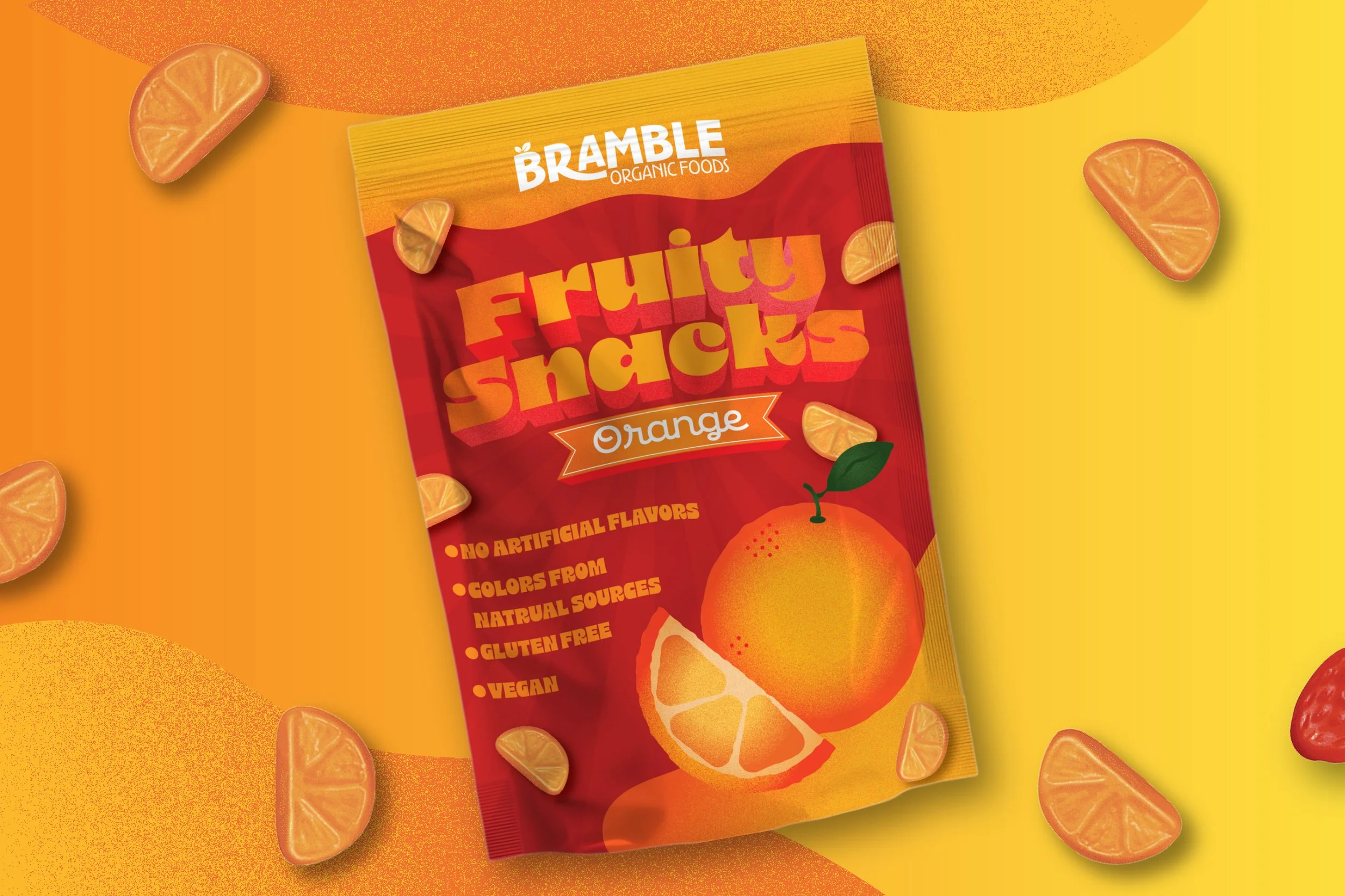
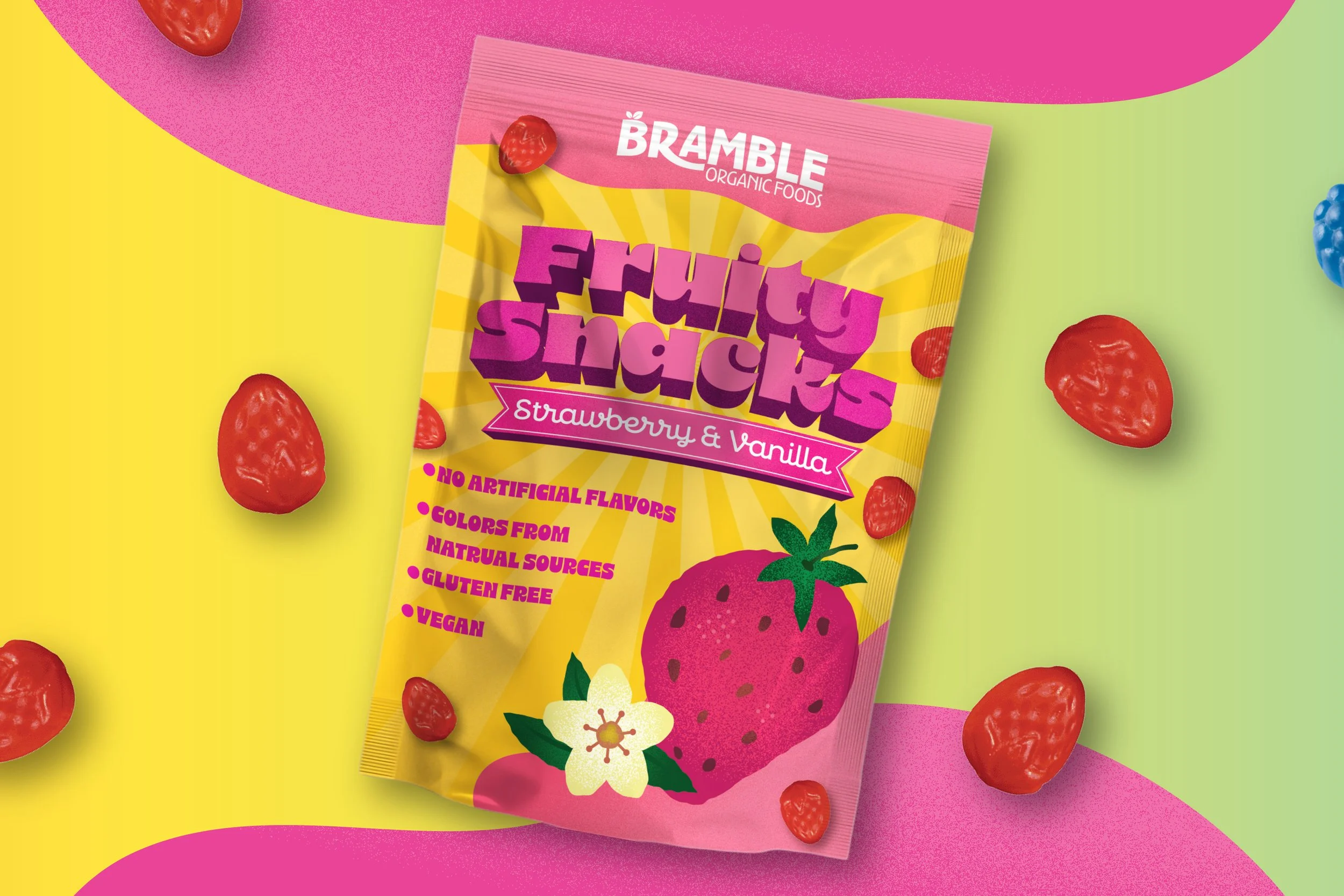
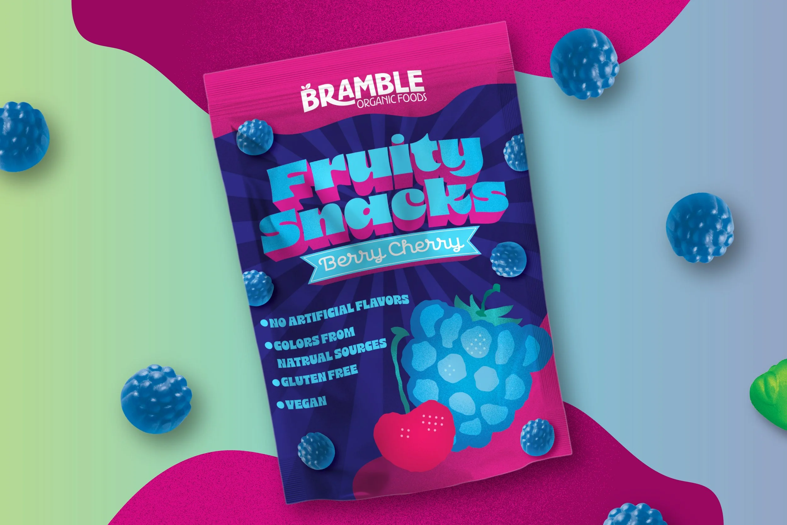
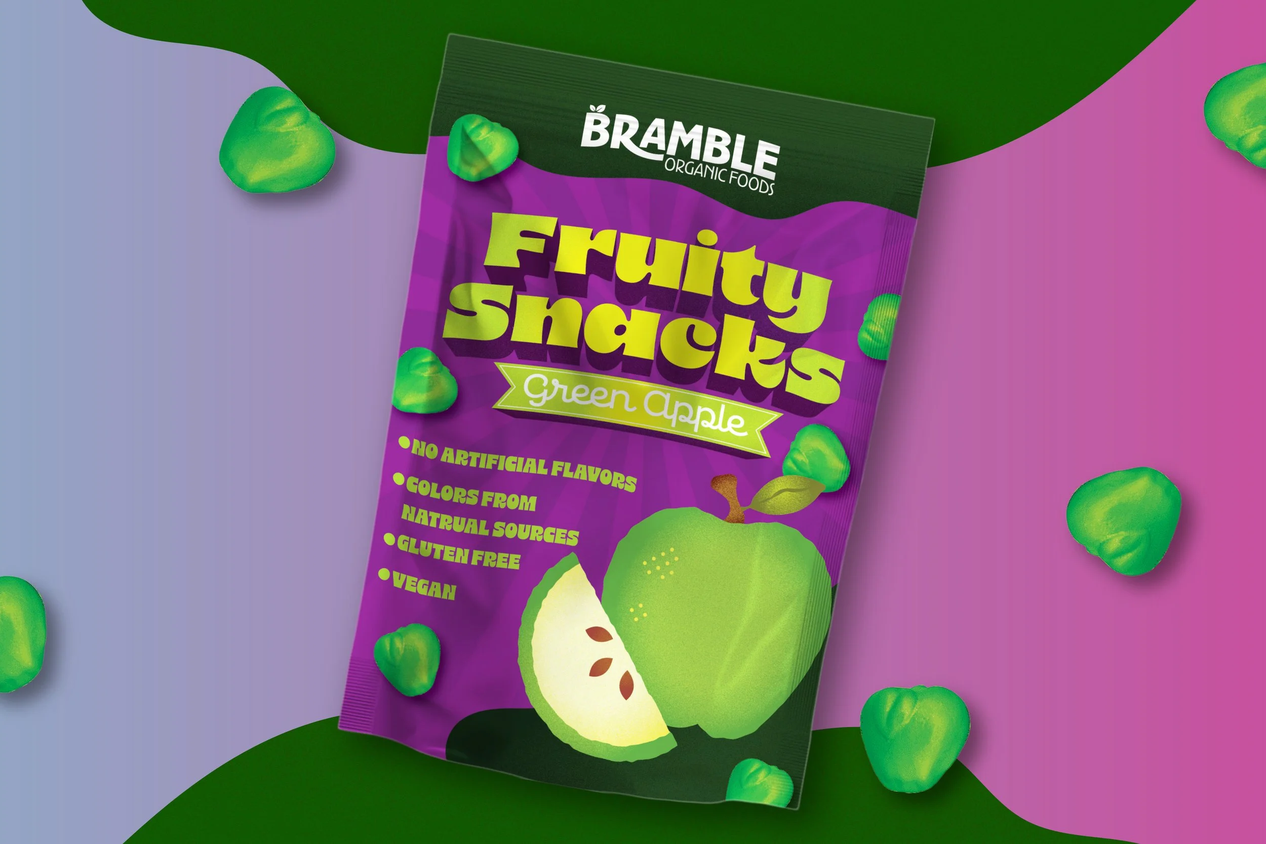
One of the first products Bramble wanted to produce was an all natural fruity snack. They wanted these products to feature whimsical fruit illustrations with vibrant colors. I ended up going for kind of a cut paper style of illustration with heavy grain texture for the fruits. This grain texture carries over into the branding for this product. The font choice is something bold in whimsical that reminded me of their logo but with a new twist.
Similar Projects

